This is part of a series of blog posts on measurement for improvement. You can read them all here.
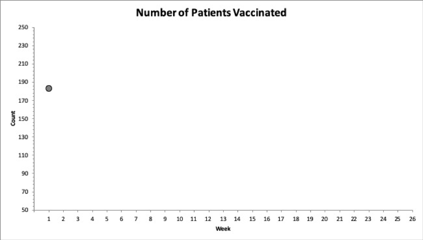
One of the most common questions for a new improver is: How many data points do I need to start a chart? The answer is just 1. Starting with the first data point lets you start learning from your data immediately. The hardest part is deciding how to scale the y-axis (vertical axis) to accommodate future data; if you’re wrong, you can fix the scale later. Here’s an example of a run chart showing the number of patients vaccinated each week.

Figure 1. Run chart started with a single data point
Add Median and Look for Signals
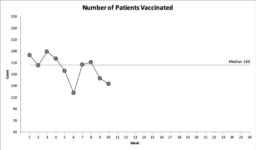
As you continue to collect data, you add additional data points. Once you have 10 data points, you can add a median (middle of the data). This can be done manually or calculated with an easy formula in Excel. If the baseline data shows no signals (see Signals and Special Cause Rules), extend the median out into the future to reflect your baseline. Here’s an example as the improvement team added a median at 10 weeks.

Figure 2. Run chart with 10 data points with baseline median added
Run charts can be very powerful for learning and are frequently used by beginners or at the start of an improvement project. Three probability-based rules can aid you in identifying signals of non-random changes. There is less than a 5% chance (p = 0.05) a shift, trend, or too few/many runs would happen randomly. An additional rule is an astronomical point that is visually outside of the pattern of the other data.
When using rate or percentage data, be sure the data has a similar denominator size (+/- 25%) to avoid the potential of data points with a small denominator size looking like a signal.
Note that run charts were made for continuous data (things you can measure like time, money, etc.) but are commonly used on attribute data (counts and classification data); in most cases, that’s okay.
Upgrade to Shewhart SPC Charts
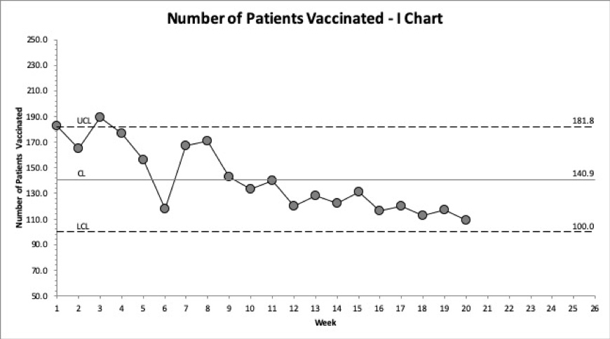
If you have baseline data or collect more data, you can use software (see here) to create a more sensitive Shewhart Statistical Process Control (SPC) Chart. Most Shewhart Charts need 12 data points to establish trial limits and 20 to set a baseline. I Charts (also known as X chart, Xmr chart, and Individuals chart) and T-charts require 20 data points. Here is an example of the team’s Shewhart Chart.

Figure 3. Shewhart Chart with limits
Shewhart Charts switch the centerline to a mean and add two additional lines called upper and lower control limits. Two common misunderstandings about control limits:
- Control limits are not specifications that have been set; they are based on math. The math to calculate the limits is different for different types of charts.
- Control limits are not three standard deviations from the mean. They are three sigma limits.
The Shewhart Chart control limits provide several enhancements over the run chart. You can apply different special cause rules (see here) that aid in helping us differentiate between what is random and what is not. Some charts have varying limits which help us understand the data more. Finally, we can apply Shewhart’s theory of rational subgrouping, where data can be reordered to create subgroups that are more alike on the same chart (by hospital, unit, shift).
Data displayed over time is a powerful tool for improvement and understanding variation. We can begin our chart with just a single data point and get more sophisticated as we get more data. What data do you have that you can make a chart? It can be from your improvement project, from data at work, or even personal data. Give it a try.
—
Want to learn about measurement for improvement? Check out my favorite book by Lloyd Provost and Sandy Murray: The Health Care Data Guide: Learning from Data for Improvement. Not in health care? Don’t worry. It’s still the best reference for improvement data and measurement out there.
—
If this was helpful, share and include me @DaveWilliamsATX. Sign up here to receive a monthly email that includes all my blog posts and other Improvement Science resources I think you’d appreciate.
