This is part of a series of blog posts on measurement for improvement. You can read them all here.
A core pillar of the science of improvement is understanding variation. We use data to learn about a system or process and to know whether our changes are resulting in improvement. Two key tools that help us learn are Run Charts and Shewhart SPC Charts to display data graphically over time. We, then, can use statistical rules to help us interpret the data.
Run charts & probability-based signals
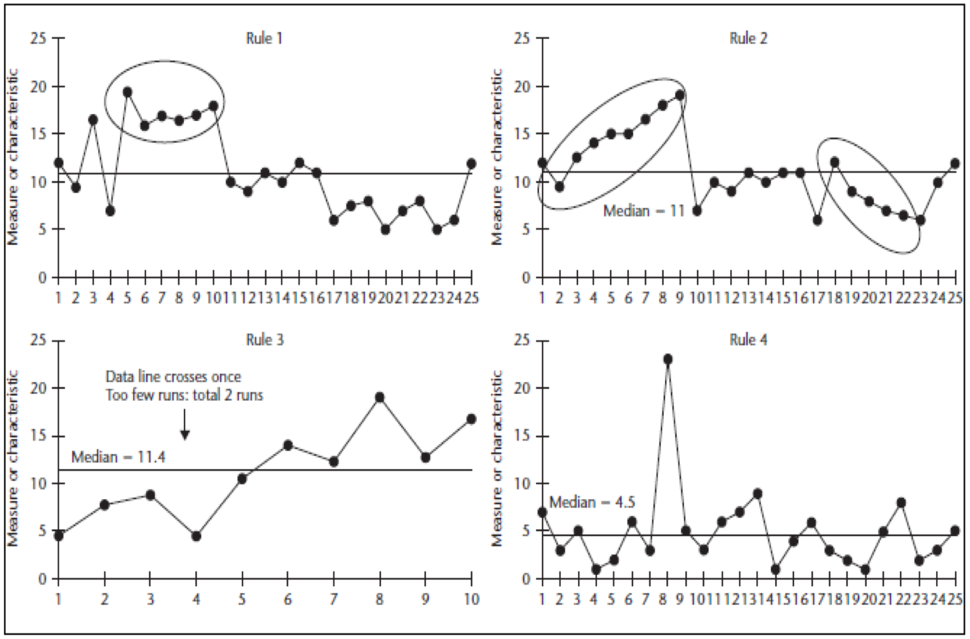
When we have a run chart with 10 or more data points, we can add a median. The median enables the use of four rules. Three probability-based rules can aid you in identifying signals of non-random changes. There is less than a 5% chance (p = 0.05) a shift of six or more consecutive points above or below the median (Rule 1), trend of five or more consecutive points going up or down (Rule 2), or too few/many runs (Rule 3) would happen randomly. An additional rule is an astronomical point (Rule 4) that is visually outside of the pattern of the other data. Figure 1 displays examples of each of the four rules for run charts.

Figure 1. Four Run Chart Rules
Shewhart Charts and Special Cause
While run charts are useful at the start of a project or with beginner teams, using Shewhart charts is more sensitive and adds the ability to distinguish between common cause or random data and special or assignable causes. Shewhart charts are not a more advanced version of a Run Chart and rely on a different theory of statistics in how we build them and analyze them. When we have enough data, Shewhart Charts are preferred over Run Charts.
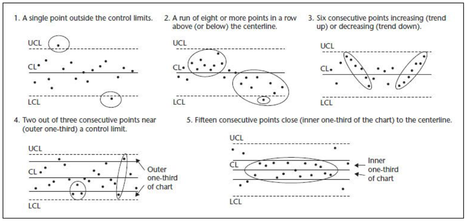
There are many rules applied to Shewhart Charts. The examples provided here are most commonly used in healthcare. Note that Shewhart rules 2 and 3 are similar to Run Chart rules 1 & 2, but they are slightly different.

Figure 2. Shewhart SPC Chart Rules for Determining Special Cause
Using the rules
Every time a run or Shewhart chart is reviewed, these rules shall be applied to interpret the chart. This helps us to see when changes we make result in improvement. With Shewhart Charts, you can distinguish between common and special cause and act appropriately.
Know that common cause variation doesn’t mean that you like it; it just says it’s a stable process. If you don’t like the performance, you know you need to change the process to get a different result. Also note, not all activity or change results in improvement. It’s not uncommon for teams to feel like they are making improvement, but it’ll be when your data shows that your change is resulting in improvement that you know.
—
Want to learn about measurement for improvement? Check out my favorite book by Lloyd Provost and Sandy Murray called The Health Care Data Guide: Learning from Data for Improvement. Not in health care? Don’t worry. It’s still the best reference for improvement data and measurement out there.
—
If this was helpful, share and include me @DaveWilliamsATX. Sign up here to receive a monthly email from me that includes all my blog posts and other Improvement Science resources I think you’d appreciate.
