
This is part of a series of blog posts on measurement for improvement. You can read them all here.
A core component of improvement work is understanding and learning from data. This can be new to many, and for some a little intimidating. One common assumption is that all data must be quantitative and involve some form of measurement over time. Some ask, “What about qualitative data?”
It’s true that improvement uses a good bit of quantitative data displayed over time in run charts or Shewhart SPC charts. This is linked to a core theory of improvement–understanding variation. We also use a lot of qualitative data. Let’s look at a few examples.
Shewhart Charts and Qualitative Data
Qualitative data is used in some measures which we can track over time. Sometimes people think these are quantitative because they involve counting things, but they often involve judgment versus measurement. This includes determining if an error occurred, whether something met a criterion or not, or whether something happened or didn’t happen. It also can include ranking data, like when we ask a patient to rank on a scale of 1 to 5 their level of agreement with their satisfaction. These data may be tracked over time and may be displayed in a run or Shewhart SPC chart like a P-chart or I-chart.
Vital Few
One of the core charting tools in improvement is the Pareto Chart. The Pareto chart is used to summarize categories of errors or defects and organize them from most common to least common. The theory is that a small – vital few – issues may contribute to the majority of the improvement opportunity. Here is an example of a Pareto Chart of reasons people tell us they didn’t get an immunization.
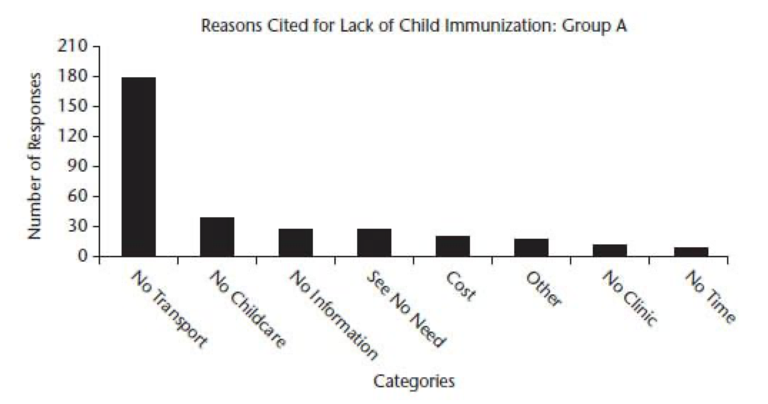
Figure 1. Example of Pareto Chart (HCDG, Figure 4.36, p.141)
To use a Pareto Chart we want at least 30 incidents. Looking at the reasons shared in the chart, it’s clear that many more people responded by saying that lack of transportation contributed to their child not getting their immunization. This is much more than other causes and helps us zero in on the category that may have the biggest impact on improvement if we could affect it.
Annotation – Matching the qualitative and quantitative
A powerful place to capture and convey qualitative data is in annotations. This can include annotation on a run or Shewhart chart that complements the data over time. Or, it can be annotations on a process map that provide context to information noted at each step. Using words to describe what’s happening can be very powerful in sharing insight about the process, its variation, and the actions being taken. Here’s an example of an annotated run chart from NHS Scotland Greater Glasgow and Clyde.
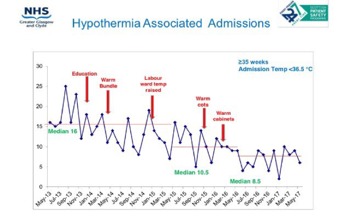
Figure 2. Annotated Run Chart (Source)
Case Presentation
Sometimes using a case that is representative of many may be summarized and used to inform. For example, describing an example of children with inequitable school outcomes. Quantitative data may be able to provide an understanding of the system and variation within, but the case persona can provide a sense from one of what is happening across many and help inform some realistic context to who is being served.
One example in health is the Esther Project in the County of Jonkoping, Sweden, where they developed a persona called Esther who is reflective and representative of a common patient population. Esther is then used as a benchmark for considering change ideas and influencing system design. It’s a powerful way to bring the person to the center of the improvement.
Grounded Theory
In improvement science, qualitative research methods are not commonly discussed, but I’ve always valued understanding Grounded Theory. Grounded Theory is a qualitative method that relies on many sources of information including observation, interview, documents, and even quantitative data to develop a theory. This method is an iterative, sense-making process where new data are compared with the existing understanding to continually refine and define a theory. While the innovation and prototyping phases of an idealized design process don’t specifically call out Grounded Theory, there’s a lot of synergy in this qualitative methodology as it applies to defining what changes we think will result in an improvement.
This is just a brief overview of qualitative data and methods in improvement. There are more than what’s described here, and each example can be covered in great detail. Consider how you can use qualitative data collection and summarization to support your work. Both qualitative and quantitative data collection and display have a part in improvement work and learning deeply.
—
Want to learn about measurement for improvement? Check out my favorite book by Lloyd Provost and Sandy Murray called The Health Care Data Guide: Learning from Data for Improvement. Not in health care? Don’t worry. It’s still the best reference on improvement data and measurement out there.
—
If this was helpful, share and include me @DaveWilliamsATX. Sign up here to receive a monthly email from me that includes all my blog posts and other Improvement Science resources I think you’d appreciate.