
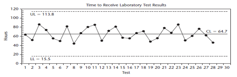
Provost & Murray. (2010). Health Care Data Guide. Figure 14.18. P. 127
Have you taken one of those silly quizzes on social media that ask you to answer several questions and then it tells you what political candidate is most like you or what part of the country you’re from? Words like grinder (long sandwich with deli meat), rotary (traffic circle), rubbish (trash), and a phrase like “bang a Uey” (do a U-turn) quickly pinpoint my roots in the 413 of Western Massachusetts even after 20 plus years in Texas. Terms can feel both familiar and comfortable and wicked (another MA give away) confusing.
Let’s look at an example in improvement. Today I saw the terms Control Chart, Statistical Process Control (SPC) Chart, Shewhart Chart, Learning Charts, and Process Behavioral Chart (PBC) all used by people to describe charts like the one above. For those of us that have studied Shewhart’s Charts, these different terms for the same thing aren’t a big deal…just preference. To most folks, it’s just plain confusing and not helpful.
Walter Shewhart developed a foundational lens of the science of improvement–understanding variation–and his charts helped us learn from it. Published in 1931, Dr. Shewhart’s Economic Control of Quality of Manufactured Product text introduced ideas like operational definitions (What’s “on-time?”) and displaying data over time in a “Control Chart.” Control charts help us to see “chance” variation (common) built into a process and the “assignable” causes (special) that are issues we need to investigate and fix. His control chart plotted sequential samples of a measure over time. He added a centerline (the average) and “control limits” calculated as a plus or minus 3 (sigma). There are different charts for different types of data.
If Shewhart called them “Control Charts,” where did these other names come from? It wasn’t Deming. He called them Control Charts in Out of Crisis and The New Economics. So, where did these names come from? Ask five statisticians and you will get five different answers, but here’s some of what we know.
Statistical Process Control – I don’t know when “statistical process” control was added to Shewhart’s original naming of the control chart. It, and its abbreviation “SPC,” is used often and it’s a common naming in publications linked to the Six Sigma tradition of quality.
Dropping “Control” – Shewhart called his charts “control charts.” Some interpret the purpose of the chart’s use to be for maintaining control of a process versus the actual use to understand the variation in the process and if it will be predictable into the future. While Shewhart’s charts can support efforts to sustain control, it is not the main intent. For this reason, some drop “control” from the name.
Shewhart Chart – Naming the chart after Shewhart is common and reflects attribution to the origin of the charts. Shewhart’s charts or Shewhart charts are used to describe the charts in books, papers, and publications. In health care, education, and other areas influenced by the work of the Associates in Process Improvement or who were taught using Provost and Murray’s (2010) text The Health Care Data Guide, people follow their lead and describe the charts as Shewhart Charts.
Learning Charts – Some use the term learning charts to emphasize the chart’s intent to understand variation and profoundly learn. It’s not widely in-use but you may encounter it.
Process Behavioral Chart (PBC) – Another common term. This name change is rooted in Dr. Donald Wheeler’s work and specifically in a very accessible and influential book — Understanding Variation: The Key to Managing Chaos (2nd Ed).
In the Preface of the 2nd Edition, Dr. Wheeler decided to change the traditionally used names for core terms because his book was applying Control Charts to non-traditional managerial and administrative data. He wanted to make the theory and the charts more accessible and reduce the jargon effect.
While Dr. Wheeler uses the term “Process Behavioral Charts” to refer to all “Control Charts” (continuous and attribute data), it’s very common when others use it that they are referring to one chart – the Individuals Chart (aka, I-Chart, XmR Chart). See my post on I-Charts to learn more.
Shewhart’s Control Charts are a very powerful tool and essential in understanding variation. It’s a foundational theory that influenced Dr. Deming’s System of Profound Knowledge. Statisticians and improvement advisors continue to support improvers to understand the ideas and apply the tools in accessible ways. Adaptations can help learners and it may confuse others, too, if referred to without clarity. They are just different terms for a common tool. I hope this helped.
—
Want to learn about Shewhart Charts and measurement for improvement? Check out my favorite book by Lloyd Provost and Sandy Murray called The Health Care Data Guide: Learning from Data for Improvement. Not in health care? Don’t worry. It’s still the best reference for improvement data and measurement out there.
—
If this was helpful, share and include me @DaveWilliamsATX. Sign up here to receive a monthly email from me that includes all my blog posts and other Improvement Science resources I think you’d appreciate.